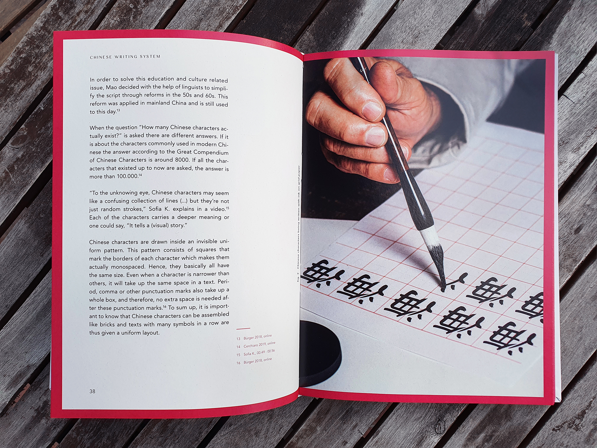
When thinking about typefaces that look Chinese, it is hard not to picture swingy, triangularly stroked letters. Due to today’s heightened vigilance towards discrimination, it can be perceived as culturally inappropriate to use these typefaces in order to create Asian-looking designs, especially when they are created and used by people with no personal ties to any East Asian culture.
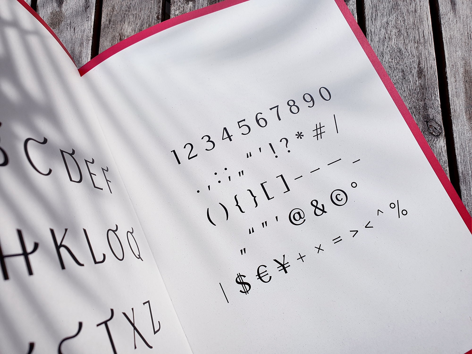
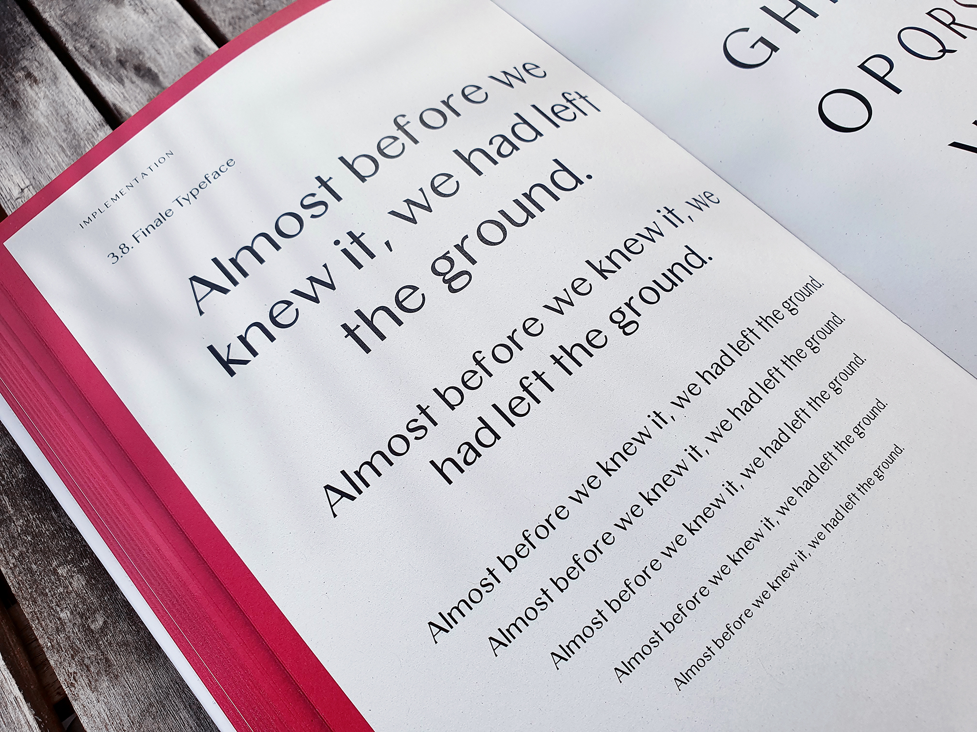
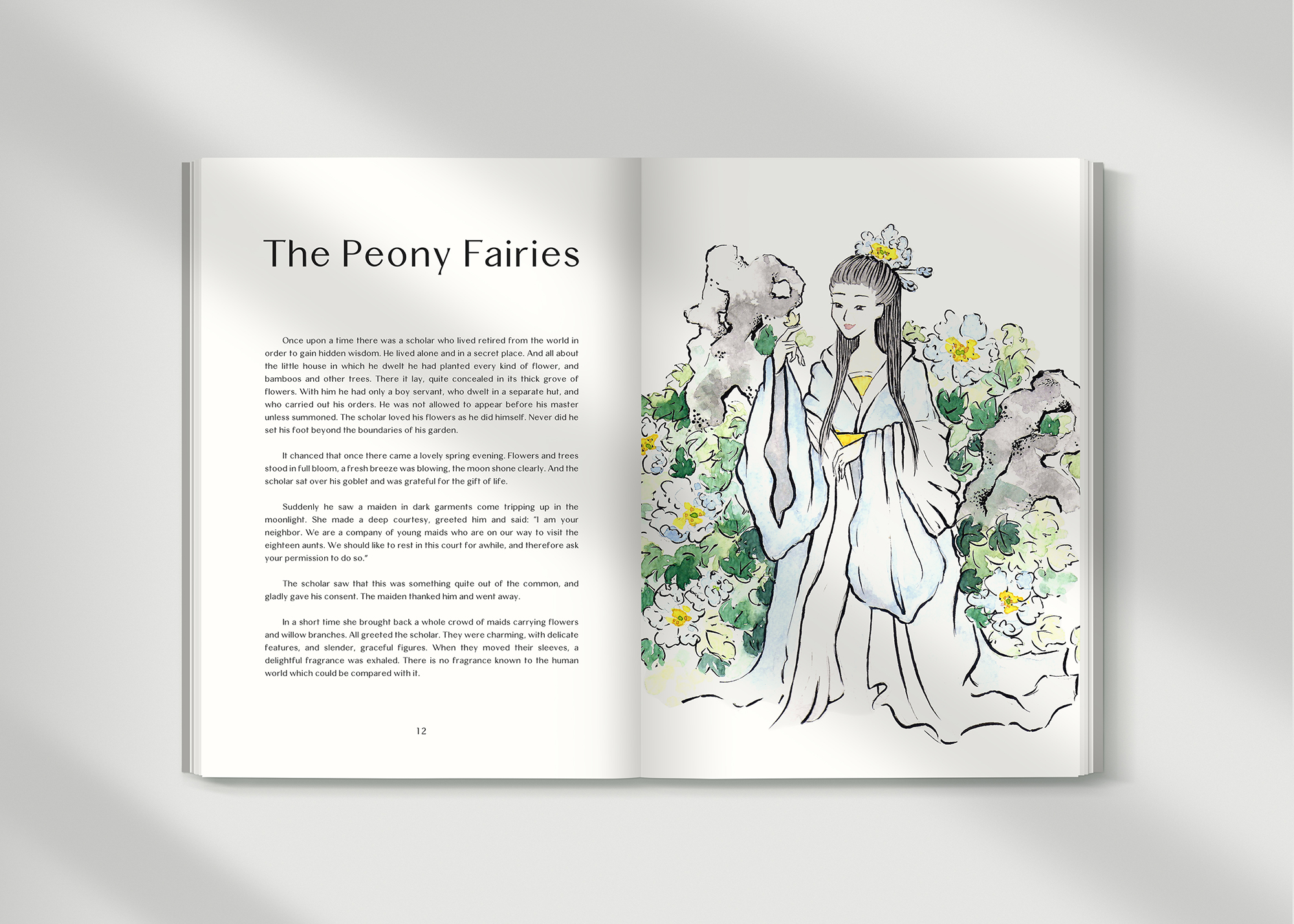
Therefore, the aim of this Bachelor’s Thesis is to break the stereotype of Asian-imitated fonts through the means of a modern, sans-serif typeface that is designed with considered features of Chinese typography in a reduced manner. Meilin is a typeface designed for both body text and display. Alternative letters with decorative features have been included to provide diverse application possibilities.


