Skip to content
Corporate Identity

Corporate Design Styleguide

The visual appearance of our university

Part of the FH JOANNEUM corporate identity (CI) is its corporate design. This comprises the university’s visual appearance and includes the design of its communication tools – printed materials, information brochures, letterhead, etc. – as well as product design and presentations. In addition to creating a clear identity and visual unity, its primary goal is to ensure that FH JOANNEUM is a recognizable brand. This style guide provides instructions on how to properly apply the corporate design.

The style guide includes rules for using the key elements of the FH JOANNEUM brand; these must be applied whenever the brand is used. This primarily relates to the logo, the corporate colours, the corporate font, and the layout grid.

By providing guidelines and setting out rules, the Corporate Design Style Guide functions as the starting point for the production of all FH JOANNEUM materials, while also allowing sufficient creative leeway for the professional creation of advertising materials used in the context of a university.

Click on the links to directly access each of the following topics:

1 The FH JOANNEUM logos | 1.1 The primary logo of FH JOANNEUM | 1.2 The secondary logos | 1.3 All logos for download |

2 Colours | 2.1 Download colours |

3 Fonts | 3.1 Download Fonts |

4 Icons | 4.1 Download icons |

5 Imagery

6 Further downloads

1 The FH JOANNEUM logos

1.1 The primary logo of FH JOANNEUM

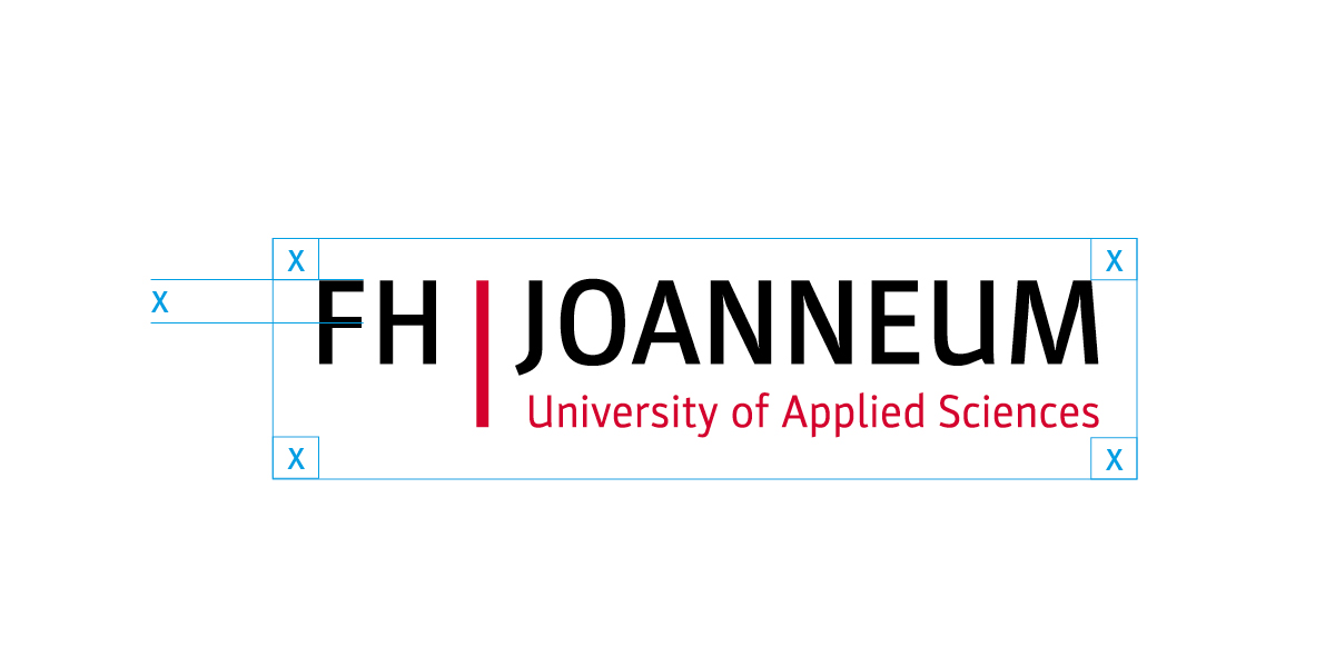
Logo construction:

The base file for our wordmark has a width of 100 mm. This corresponds to 100%.

  1. The lettering is set in the font Parka Medium.
  2. The graphic element – the vertical bar – is the visual bracket and is also used as the colour code.
  3. The subline, or tagline, is set in the font Parka Regular.

The primary logo of FH JOANNEUM is a wordmark.

Clear space around the logo

Whenever the logo is used, it should be surrounded with clear space. The minimum clear space around the logo is clearly defined and must be strictly adhered to on all advertising materials. The minimum distance to other design elements such as text and illustrations equates to the cap height of “FH JOANNEUM” on all sides (X = cap height of FH). Where only limited space is available for the logo, the clear space may be reduced to half the cap height.

Recommended maximum clear space | X = cap height of FH

Logo sizes

The minimum logo size is 35 mm width on printed materials, and 170 px width for web applications. Consequently, the subline has a minimum font size of 6 points, to ensure its readability. Logo 2 is used for formats of less than 35 mm.

Recommended minimum clear space | X = half cap height of FH

Logos for different DIN formats.

Mono

The logo may also be inverted for stamps and 1-colour pad printing (solid printing), in white or positive black.

Logo in black on white

Logo in white on black

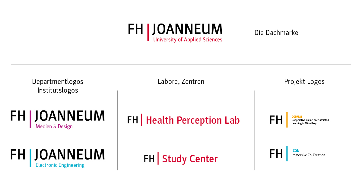
1.2 The secondary logos: Departments, Institutes, Laboratories, Centers and projects

Secondary logos are provided for the visual communication of the departments, institutes, laboratories, centers and projects. They use the well-known and clearly understood system of symbols, allowing the observer to perceive and decode the content faster.

Logo variations of FH JOANNEUM – Department and Institute logos; Laboratories and centres; Umbrella brand and Project logos

1.3 All logo variants for download

2 Colours

Primary colours

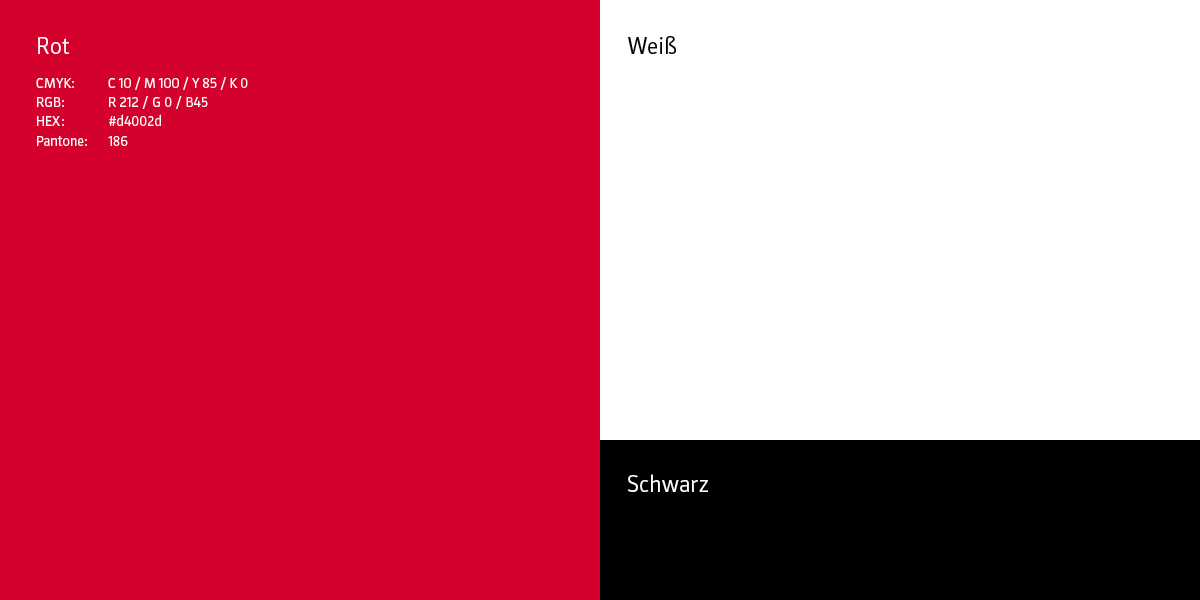
The primary colours of FH JOANNEUM are red, black and white.

Red
CMYK: 10c, 100m, 85y, 0k
RGB: R212, G0, B45
HEX: #d4002d
Pantone: 186

The primary colours of FH JOANNEUM

Secondary colours / Department colours

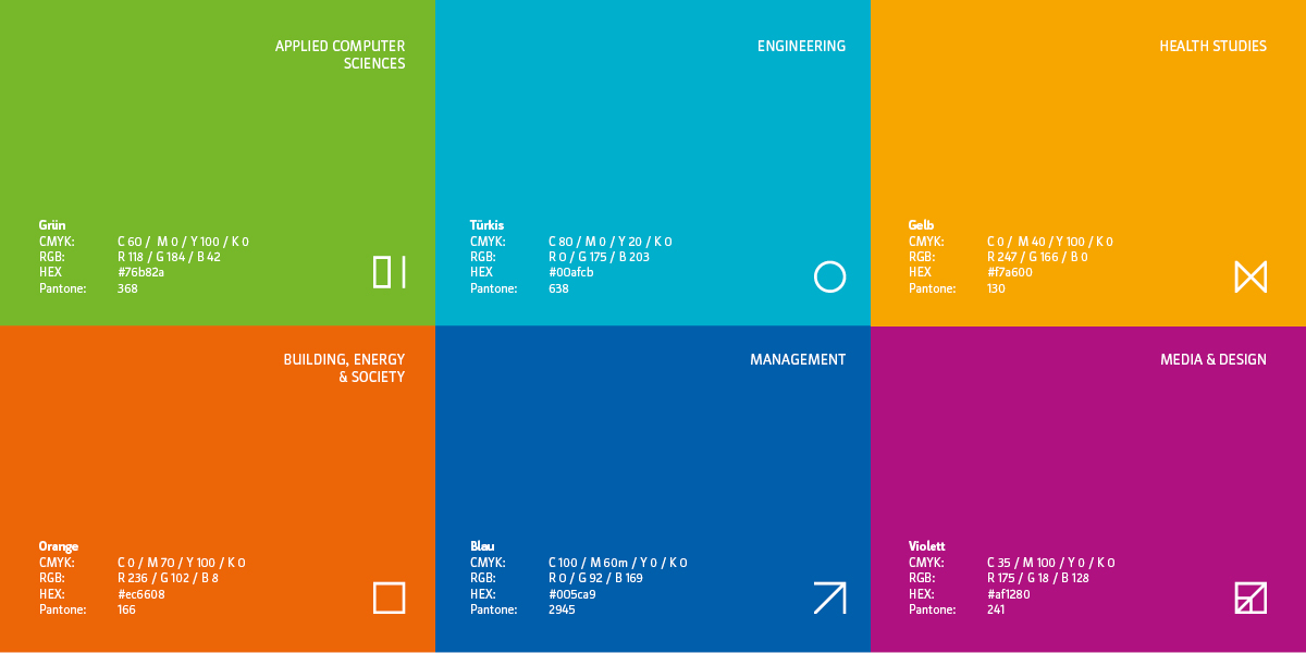
The secondary colours of FH JOANNEUM are the six Department colours:

Applied Computer Sciences: Green
CMYK: 60c, 0m, 100y, 0k
RGB: R118, G184, B42
HEX: #76b82a
Pantone: 368

Building, Energy & Society: Orange
CMYK: 0c, 70m, 100y, 0k
RGB: R236, G102, B8
HEX: #ec6608
Pantone: 166

Engineering: Turquoise
CMYK: 80c, 0m, 20y, 0k
RGB: R0, G175, B203
HEX: #00afcb
Pantone: 63

Health Studies: Yellow
CMYK: 0c, 40m, 100y, 0k
RGB: R247, G166, B0
HEX: #f7a600
Pantone: 130

Management: Blue
CMYK: 100c, 60m, 0y, 0k
RGB: R0, G92, B169
HEX: #005ca9
Pantone: 2945

Media & Design: Purple
CMYK: 35c, 100m, 0y, 0k
RGB: R175, G18, B128
HEX: #af1280
Pantone: 241

FH JOANNEUM colour palette

2.1 Download Colours

3 Fonts

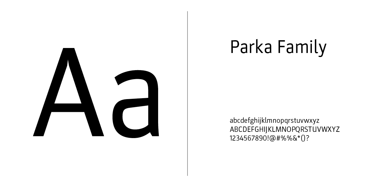
Parka

The FH JOANNEUM corporate font is PARKA by Daniel Perraudin. It incorporates a wide range of font styles, and its appearance is factual and informative. This font is exclusively used by graphic designers working with professional desktop publishing (DTP) software. The fonts Calibri (sans serif) and Georgia (serif) may also be used as alternatives for office use.

PARKA by Daniel Perraudin

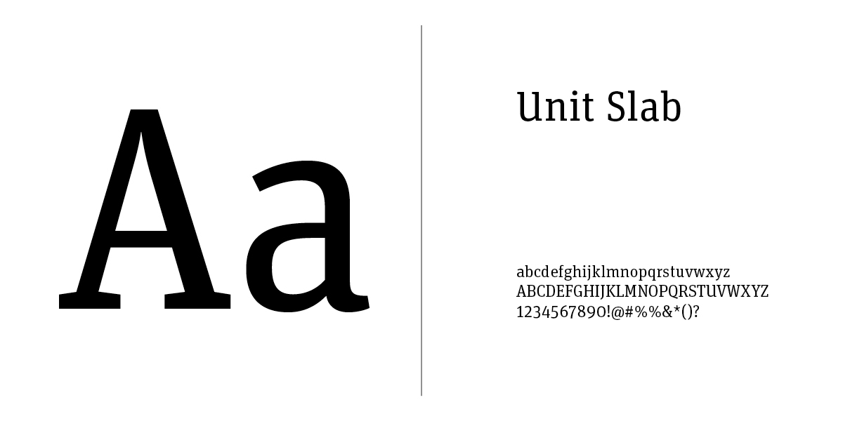
FF Unit Slab

The contrasting font family is FF Unit Slab. Mixing a sans serif with a serif font keeps the typography lively. The FF Unit Slab by Erik Spiekermann is used as a secondary font to give the overall appearance a greater complexity. It is primarily used for longer body text (magazines, books), for awards, lead texts, and captions. This font is exclusively used by graphic designers working with professional desktop publishing (DTP) software.

FF Unit Slab

3.1 Download font package

4 Icons

FH | Icon

Our icon can be used as a profile picture on social networks, as an app icon or as a favicon (16 x 16 px).

FH JOANNEUM icon

Department icons

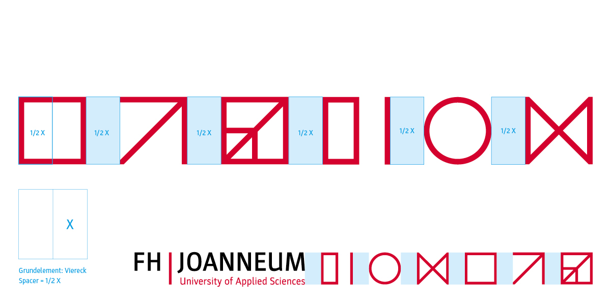
The Departments as dynamic signets: simple, flat, and easy to read on digital devices. The guiding principle behind the system of symbols is interdisciplinarity. The different symbols can be combined, also representing the unity of the individual Departments. The symbols are a visual description of the Departments and serve as sub style elements. They formally derive from the vertical bar in the central FH JOANNEUM logo. They act to expand the visual vocabulary and are intended to provide visual orientation.

The Department icons of FH JOANNEUM: Applied Computer Sciences, Engineering, Health Studies, Building, Energy & Society, Management, and Media & Design.

Base element: Square. Space = 1/2 X

4.1 Download Icons

5 Imagery

FH JOANNEUM imagery

Images should be designed to meet the needs of the users, which will be surveyed in advance. They are part of the overall visual concept, and an integral element in the FH JOANNEUM content strategy. The concept is designed to create a high recognition factor, and to transport the key messages as clearly as possible. Cliched images should be avoided, instead they should communicate specific information in accordance with the message architecture. In addition, images should portray technologies and objects together with people. Group pictures should not be used. University employees should be shown in the context of their employment, i.e., the relevance to their area of work should be clear from the image background.

Important points to note:

  • We do not use stock images, only images showing authentic persons.
  • People should be portrayed working within their own specific fields of activity.
  • No more than three people to be shown in a single image.
  • The image colour is slightly desaturated.
  • Illumination: no flash, only available light, reflector used to brighten.

6. Further downloads

Here you will find additional downloads relevant to the visual appearance of FH JOANNEUM.

This site is registered on wpml.org as a development site. Switch to a production site key to remove this banner.